
When you’re creating images for the LinkedIn feed, you have two primary choices that work best: 1200 x 1200 pixels for a classic square post or 1080 x 1350 pixels for a taller, vertical one. Nailing these dimensions is the first step to making sure your content looks sharp and professional, avoiding those weird, awkward crops that kill your credibility on both desktop and mobile.
Let's get straight to it: getting your LinkedIn image sizes right isn't just about making things look pretty. It's a performance issue. The right dimensions ensure your visuals are crisp, clear, and grab attention while people are scrolling. A poorly sized image gets blurry, cut off in the wrong places, or just completely fails to make an impact.
At the heart of this is a simple concept: understanding what is aspect ratio. This little number dictates the shape of your image and how it fills the screen—a key detail, especially since most of your audience is probably viewing on a phone.
This infographic gives you a quick visual breakdown of the most common aspect ratios for feed posts.
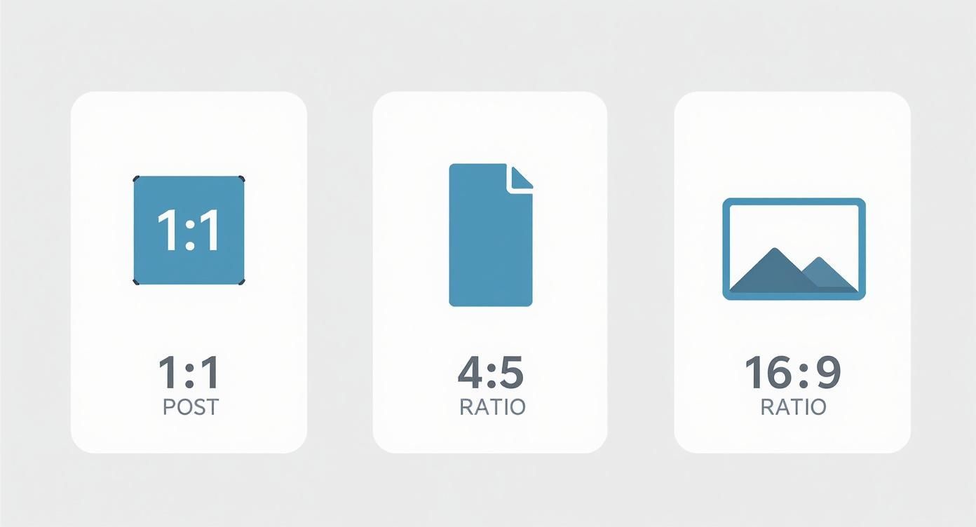
As you can see, both square and vertical images take up more screen real estate on mobile devices. That's exactly what you want—more space means more attention on your content.
Why We Moved Beyond Landscape
It wasn't always this way. For a long time, LinkedIn pushed a standard landscape format of 1200 x 627 pixels. But as mobile traffic exploded, the data started telling a different story. Analytics showed that square images were pulling in 23% more engagement. This shift in user behavior is what prompted LinkedIn to officially get behind square and vertical formats.
The bottom line is simple: your goal is to maximize your visual real estate. A perfectly sized image stops the scroll and gives people a reason to engage with your message, which is how you earn likes, comments, and shares.
Once you’ve got your images dialed in and your post is live, the next part is getting that early traction. With our Upvote.club service, you can create tasks for real users to interact with your content, giving your post the momentum it needs in that first hour. We operate on a community-based model where users help each other grow. You earn points for completing tasks, and then use those points to create your own tasks for your content.
Getting Your Personal Profile Images Right
Your personal profile is your digital handshake on LinkedIn. Let's be honest, it's the first thing anyone sees. Those two visuals—your profile picture and background photo—are what create that first impression. Getting them right is the foundation for building a professional presence that makes people pause and take you seriously.
Think of these two elements as a team. A sharp profile picture builds that initial human connection, while the background photo gives context about your industry, your skills, or your personal brand.
Your LinkedIn Profile Picture Size
Your profile picture is the single most important part of your identity on the platform. It shows up everywhere: search results, comments, connection requests. It's your face to the professional world, so nail it.
- Recommended Dimensions: 400 x 400 pixels
- Minimum Size: 400 x 400 pixels
- File Size Limit: 8 MB
- Supported File Types: JPG, PNG
Here's the catch: you upload a square image, but LinkedIn displays it as a circle. That means you need to center your face and leave a good amount of empty space around the edges. Otherwise, the circular crop will chop off key parts of your headshot. Simple mistake, but easy to avoid.
Of course, it's about more than just the specs. There's an art and science to what makes a truly effective LinkedIn photo. Go for a high-resolution, professional headshot where you're clearly the main event. Ditch the distracting backgrounds or group shots—the focus has to be 100% on you.
Your LinkedIn Background Photo Size
That big banner at the top of your profile? That's your background photo, and it's prime real estate. Don't waste it. This is your chance to inject some personality and professional context right where everyone can see it.
A well-designed background photo can instantly communicate your specialty, showcase an achievement, or highlight your company's brand. It transforms your profile from a simple resume into a compelling professional landing page.
Here are the numbers you need to know:
- Recommended Dimensions: 1584 x 396 pixels (that’s a 4:1 aspect ratio)
- File Size Limit: 8 MB
- Supported File Types: JPG, PNG
One detail to remember: your profile picture will overlap a chunk of the background image on the lower-left side. You absolutely have to design your banner with this in mind. Keep any important text, logos, or design elements away from that area to make sure they're visible on both desktop and mobile.
Company Page Image Specifications
Think of your LinkedIn Company Page as your brand's digital headquarters. Just like a physical storefront, first impressions count, and that impression is almost completely visual. Nail your image sizes, and you look sharp, credible, and buttoned-up. Get them wrong, and you look like you don't care.
The two images that do the most heavy lifting are your logo and cover photo. They’re the first thing anyone sees, working together to lock in brand recognition instantly. A crisp logo says who you are; a compelling cover photo tells people why they should care.
Your Company Logo
This is the small square icon that shows up everywhere—next to your company name on your page, in search results, and on every post you share. It’s the anchor for your brand on the platform, so it needs to be perfect.
- Recommended Dimensions: 300 x 300 pixels
- Aspect Ratio: 1:1 (a perfect square)
- Maximum File Size: 3 MB
- File Formats: JPG, PNG
Keep it simple. A clean, high-resolution version of your logo is all you need. Don't try to cram in extra text or taglines; it'll be unreadable at the small sizes LinkedIn displays it.
Company Cover Photo Guidelines
This is the big banner stretching across the top of your page. It's prime real estate for showing off your brand's personality, announcing a new product, or giving a peek into your company culture. Its dimensions are completely different from a personal profile's background photo.
- Recommended Dimensions: 1128 x 191 pixels
- Aspect Ratio: Roughly 5.9:1
- Maximum File Size: 3 MB
- File Formats: JPG, PNG
Here's the catch: this image gets cropped differently depending on the device. On mobile, the left and right sides get chopped off. So, place your most important content—like text, faces, or key graphics—smack in the middle to guarantee it's always visible.
Images for the Life Tab
The 'Life' tab is your secret weapon for employer branding. It’s where you can ditch the corporate talk and show potential hires what it’s really like to work with you. Strong, correctly sized visuals here can be the deciding factor for top talent.
Your 'Life' tab is where you tell your story. It's your chance to help a future star employee see themselves as part of the team, making your company feel more human and a whole lot more attractive.
Here are the specs you'll need for this section:
- Main Image: 1128 x 376 pixels
- Custom Module Images: 502 x 282 pixels
Keeping these visuals consistent helps you build a cohesive narrative about your company culture.
Once you’ve got a killer-looking company page, your next job is to get eyes on it. Attracting an audience is necessary if you want your content to land. We break down the best strategies in our guide on how to get more LinkedIn followers. Building that base gives your perfectly crafted posts a fighting chance. With our Upvote.club service, we can help you get that initial traction by connecting you with real users, giving your content the push it needs to start growing on its own.
Mastering Image Posts in the LinkedIn Feed
The LinkedIn feed is a crowded space. To stop the scroll, your single image posts have to do some heavy lifting. You’ve got three main formats to work with: the traditional landscape, the versatile square, and the mobile-first vertical. Picking the right one isn't just about aesthetics; it’s a strategic choice.

Getting the sizes right means your visuals show up crisp and clean, without any weird, unprofessional cropping. This isn't just about looking good—it's about performance.
The Three Core Feed Image Formats
Your choice of format should depend on your content and where your audience is scrolling. Landscape used to be the default, but with mobile usage dominating, formats that take up more screen real estate are winning.
-
Landscape (1.91:1 ratio): This is the classic, wide format, best at 1200 x 627 pixels. It’s good for panoramic shots or graphics that just need that horizontal layout. The major downside? It occupies the least amount of vertical space on a mobile feed, making it easy to scroll right past.
-
Square (1:1 ratio): A balanced and highly effective format. Use 1200 x 1200 pixels. Square images have a clear advantage over landscape on mobile devices simply because they take up more of the screen. That extra real estate is often all you need to stop a user in their tracks.
-
Vertical (4:5 ratio): This is the undisputed champion for mobile. At 1080 x 1350 pixels, this format absolutely maximizes the vertical space on a phone, making your post incredibly hard to ignore. It's the perfect choice for portraits, infographics, or any visual that needs to command attention.
For maximum impact, make square or vertical images your default. It’s a simple adjustment, but the more screen your image fills on a phone, the better your chances of engagement. That tiny change can make a huge difference in your post's reach.
Understanding Link Preview Images
When you share a link to an external article or website, LinkedIn automatically pulls in a preview image, title, and description from that page's metadata. The ideal size for this link preview image is 1200 x 627 pixels—the same as the landscape format.
You can't change this image directly within LinkedIn. The platform reads what’s called the og:image tag in the website's HTML code. So, to control the preview, you have to make sure that tag is pointing to the right image on the webpage before you share the link. You can use tools like LinkedIn’s Post Inspector to check how your link will look and fix any issues ahead of time.
Once you’ve nailed your image and hit "publish," the first hour is everything. Getting early engagement signals to the algorithm that your content is good and worth showing to more people. With our Upvote.club service, we help you build that initial momentum. You can set up tasks for real people in our community to provide authentic likes and comments on your post. This early push can be the key to breaking through. Similarly, getting others to share your content is a powerful growth tactic; you can find out more about how to encourage sharing in our guide on getting more LinkedIn reposts.
How to Nail Your Carousel Posts
Carousels are easily one of the most powerful tools in your LinkedIn toolkit. They let you bundle multiple images into a single, swipeable post, turning a simple update into a mini-presentation. This format is perfect for breaking down complex ideas, telling a story, or walking people through a step-by-step guide.
To make a carousel that flows seamlessly, every single card needs to be the right size. Get the dimensions wrong, and you'll end up with awkward crops that break the narrative and make your post look sloppy.
Carousel Card Specs
Consistency is everything. For a polished, professional look, every "card" or image in your carousel must have the exact same dimensions. You've got two solid options that both look great in the feed.
- Square (1:1 Ratio): Go with 1080 x 1080 pixels. This is the go-to size for most people—it's clean, balanced, and works perfectly on both desktop and mobile.
- Vertical (4:5 Ratio): Use 1080 x 1350 pixels. This taller format is a killer on mobile devices. It takes up more of the screen, making your content feel more immersive and harder to ignore.
Whichever size you pick, remember the technical rules. LinkedIn lets you include up to 10 images in a single carousel. You can use JPG, PNG, or even non-animated GIF files.
Design Tips to Get More Engagement
The best carousels don't just dump information; they pull the reader from one slide to the next. Ever since they rolled out, carousels have been a marketer's favorite for a reason—they just work. Data consistently shows they drive way more engagement than a single-image post, simply because people can't resist swiping to see what's next. For more data and a deep dive into post sizes, check out this LinkedIn guide from Analyzify.
The secret to a great carousel is building curiosity. Use visual cues like arrows or connecting lines that bleed from one slide to the next. Treat the first card like a headline that makes a promise, and use the following slides to deliver on it.
Once you’ve published your masterpiece, that first hour is very important. This is where our service at Upvote.club can give your post the initial traction it needs. We create tasks for real people in our community to leave genuine likes and comments, signaling to the LinkedIn algorithm that your content is worth showing to more people. The visual storytelling strategies are surprisingly similar across platforms; you might find some fresh ideas in our guide on how to use Instagram for business.
Boosting Your Post Engagement After Publishing
Nailing your LinkedIn image sizes is only half the battle. Once you hit publish, the real work begins. The first hour your post is live is the most important window of opportunity—it's when the LinkedIn algorithm decides if your content is worth showing to a wider network.
Getting immediate engagement—likes, comments, and shares—sends a strong signal that your post is high-quality. This initial traction is what pushes your content beyond your immediate connections and into the feeds of a much broader, more relevant audience. Without it, even the most perfectly designed image can just fizzle out.
The Power of the First Hour
This idea of the "Golden Hour" is pretty simple: posts that get quick interaction are rewarded with more visibility. This is the exact strategy major agencies use to give their clients' content an initial push, making sure it gets seen. Strong early signals tell the algorithm your content is good, which can kick off a wave of sustained organic reach.
On the flip side, a post that gets little to no interaction in that first hour is often dead on arrival. The algorithm just assumes it isn't interesting and stops showing it to new people. This is why having a plan for what you'll do after you publish is just as important as the content itself.
Driving Authentic Interaction with a Community
This is where a community-based approach can make all the difference. With our service at Upvote.club, we help you get that necessary initial push. You can create tasks asking real, verified members of our community to interact with your LinkedIn content shortly after it goes live.
Our platform is not about buying engagement; it's about participating in a community. With our service, you earn points by completing tasks for other members. You then use those points to create your own tasks, like getting genuine LinkedIn likes on a brand-new post. It’s a sustainable cycle of real people helping each other grow.
By participating in a community, you gain access to authentic interaction that works with platform algorithms, not against them. This method provides the traction needed to help your content perform better organically, without sharing passwords or compromising your account's integrity.
When you sign up at Upvote.club, we give you 13 free points and 2 task slots to get you started right away. By helping others in the community, you earn the ability to promote your own content, making powerful growth methods accessible to everyone.
Common Pitfalls and Technical Best Practices
Nailing the right dimensions is only half the battle. If you want your images to look sharp and professional every single time, you need to get a few technical details right. Simple mistakes with file types or compression can lead to blurry, pixelated, or badly cropped visuals that quietly sabotage your credibility.
Think of file formats as different tools for different jobs. Using the wrong one can instantly wreck your image quality. It's a small detail, but it makes a huge difference.
Choosing the Right File Type
- JPG (or JPEG): This is your workhorse for photographs. JPGs are brilliant at handling the complex colors and gradients you see in a headshot or a real-world photo. They use "lossy" compression, which cleverly reduces file size by ditching some data, but for photos, you'll never notice the difference.
- PNG: Save PNGs for graphics with text, logos, or solid blocks of color. PNGs use "lossless" compression, which means they keep every single detail, ensuring text and lines stay perfectly crisp. The files are a bit larger, but it's a necessary trade-off for clean, sharp graphics.
- GIF: LinkedIn supports them, but you should use GIFs sparingly. They're really only for simple, non-animated graphics or when you need the smallest possible file size. Honestly, for almost any professional graphic on LinkedIn, PNG is the smarter choice.
Compression Without Compromise
LinkedIn has file size limits, so compressing your images is a necessary step. The trick is to shrink the file just enough to meet the platform's requirements without making it look like a blurry mess. Most modern image editors have a "Save for Web" or "Export As" feature that lets you see a live preview of the quality as you tweak the compression level.
A solid rule of thumb is to aim for a quality setting of 70-80% for your JPGs. This hits the sweet spot between file size and visual quality, keeping your photos sharp while making sure they load fast for everyone.
Avoiding Common Cropping Mistakes
One of the most frequent slip-ups we see is putting important information too close to the edge of an image, especially cover photos. Remember, LinkedIn’s interface will crop or cover parts of your image depending on the device.
For instance, your profile picture will always obscure the lower-left corner of your personal background photo. The edges of a company cover photo often get trimmed on mobile screens. You absolutely have to keep key elements—like logos, text, or faces—inside a central "safe zone" so they stay visible no matter how someone is viewing your profile.
Common Questions & Quick Fixes
Got a nagging question about your LinkedIn images? You're not alone. Here are some of the most common issues people run into, along with some quick, actionable answers to get your visuals looking sharp.
Why Do My Images Look Blurry on LinkedIn?
This is a classic problem, and it usually comes down to one of three things: the image was too small to begin with, it got over-compressed, or it's the wrong file type for the job.
Always start with a high-resolution image that meets or exceeds LinkedIn's recommended dimensions. When you're ready to export, think about what's in the image. For photos with lots of detail and color gradients, JPG is your best bet. But for graphics with sharp lines, text, or logos, a PNG file is essential to keep things crisp and avoid that fuzzy, pixelated look.
What's the Best Image Size for a Mobile Post?
Mobile is where most of the action is, so you have to optimize for that vertical scroll. The two best formats are square (1:1 aspect ratio, 1200×1200 pixels) and vertical (4:5 aspect ratio, 1080×1350 pixels).
Both of these take up more screen real estate on a phone than a traditional landscape image. That means they grab more attention and make it that much harder for someone to just scroll right past your content.
Can I Edit the Thumbnail for a Shared Link?
Unfortunately, no. Once you paste a link into the post editor, LinkedIn pulls the thumbnail image automatically and locks it in. You can't change it directly on the platform.
The image that appears is dictated by the og:image tag in the webpage's metadata. If you want to control the thumbnail, you have to make sure the right og:image tag is set on the webpage before you share the link. There's no retroactive fix for this one.
Once you've nailed your image specs, the next part is sparking that initial engagement. With our Upvote.club service, we help you get those first-hour likes and comments from real people in our community. You create tasks for interaction, giving your content the boost it needs to get noticed by the LinkedIn algorithm. Check it out and get started for free at Upvote.club.
More articles
alexeympw
Published November 13, 2025